The Design Process
What makes this composite image work so well? The answer is the almost identical angle of the shadows in both background and foreground. I cut the kids on the rocks out from that photo's original background—the Willamette Valley in Eugene, Oregon as seen from the top of Spencer's Butte—then dropped them onto a view of Manhattan as seen from the Empire State Building. Both photos were originally in color and the effect just wasn't ringing true for me until I converted the entire image into a greyscale composite, at which point I had that "aha" moment.
For the main title type treatment I chose a condensed face that would represent the tall and imposing skyline of New York City, and this also solved the problem of how to fit such a long word as Manhattan on one line. Both the subhead and the author byline are the same family as the title, and the playful treatment of the word "of" is a nod to the kids on the rocks.
Software: Adobe InDesign, Adobe Photoshop, Adobe Illustrator
The Design Process
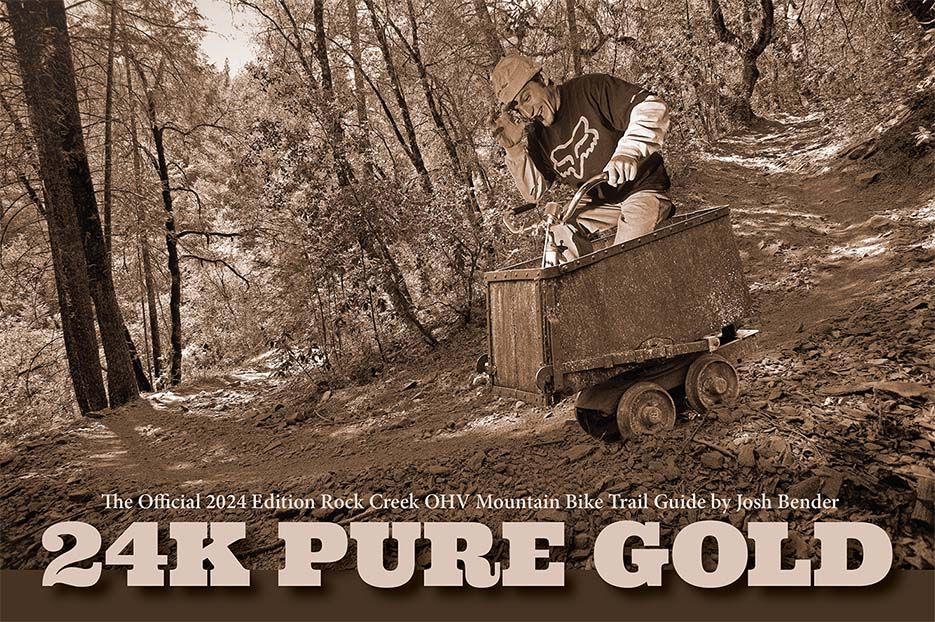
This non-standard book size was chosen because of the interior topo maps which worked best in their original horizontal aspect ratio. Cover image was created using elements of three separate photos taken by Simeon Schatz (the figure on the bike, the gold mining cart, and the mountain bike trail), with the final touch of the sepia treatment making the image work visually. For the type treatment I wanted something that conveyed the Old West.
Software: Adobe InDesign, Adobe Photoshop