graphic design: product packaging
The key to creating good packaging design is being able to envision how two-dimensional art will look on a three-dimensional object such as a box or a can. Using a template provided by the printing company is the best way to ensure absolute perfection in your finished product.client: 528 hz gardens
This client has a recreational cannabis store in Portland and a farm in Southern Oregon which supplies the store's products. I was in charge of branding the farm through the design of several packaged products as shown below.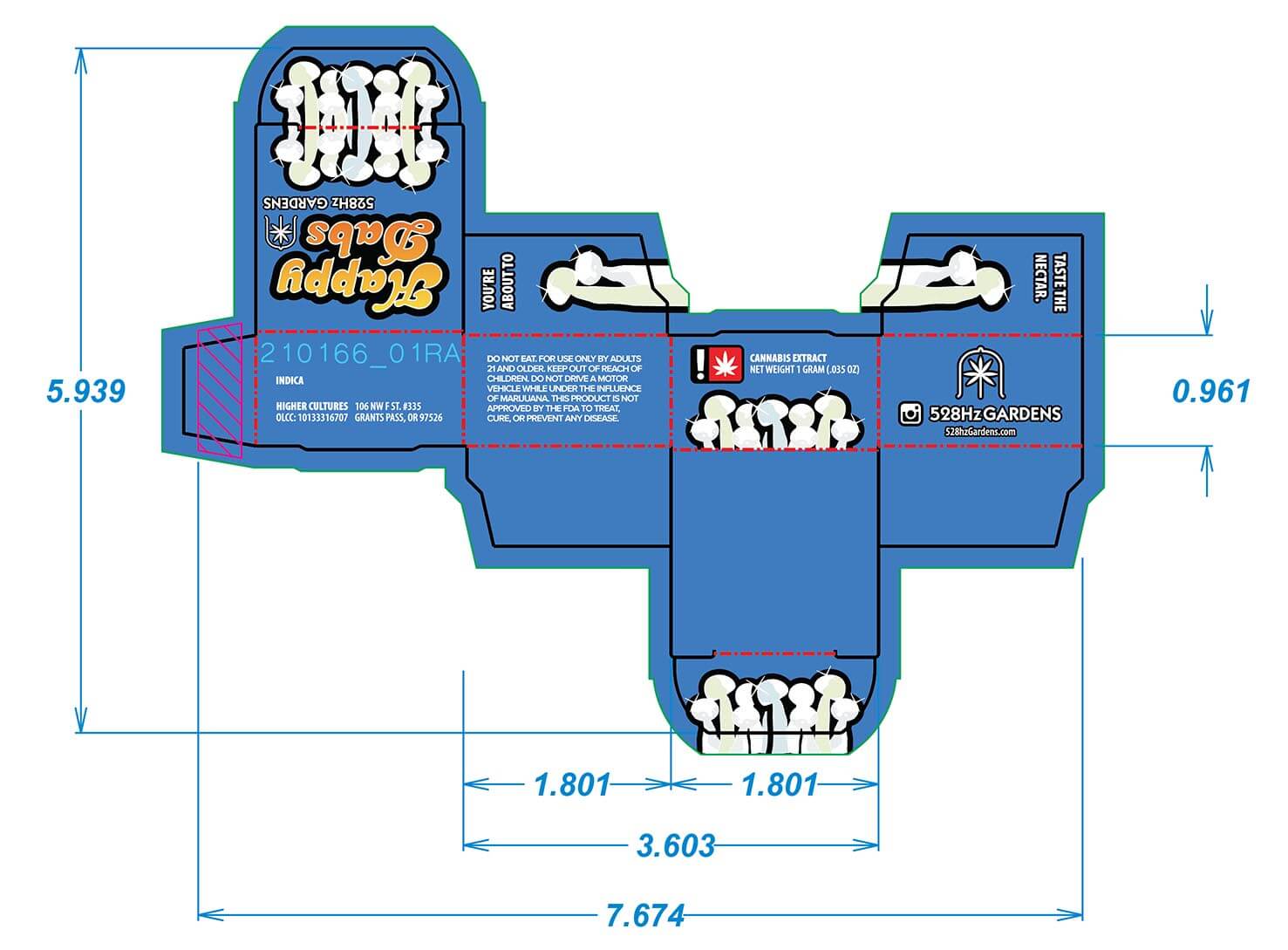
folded box design: happy dabs
The client, 528Hz Gardens, wanted a retro 70s look with a catchy name reminiscent of a certain 70s television show. Box colors were chosen based on current market research, and I created this design in Adobe Illustrator using the PDF template provided by the box printing company.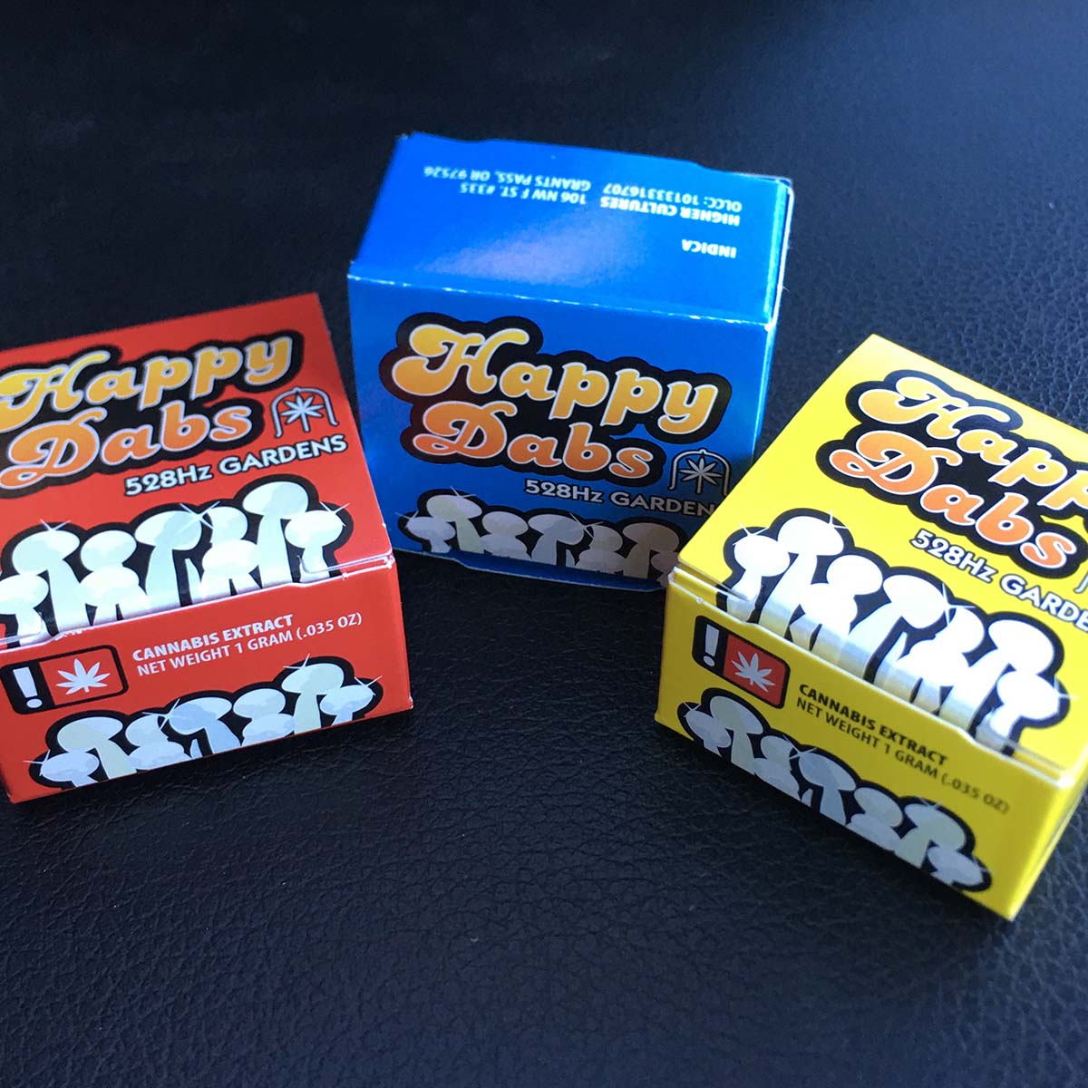
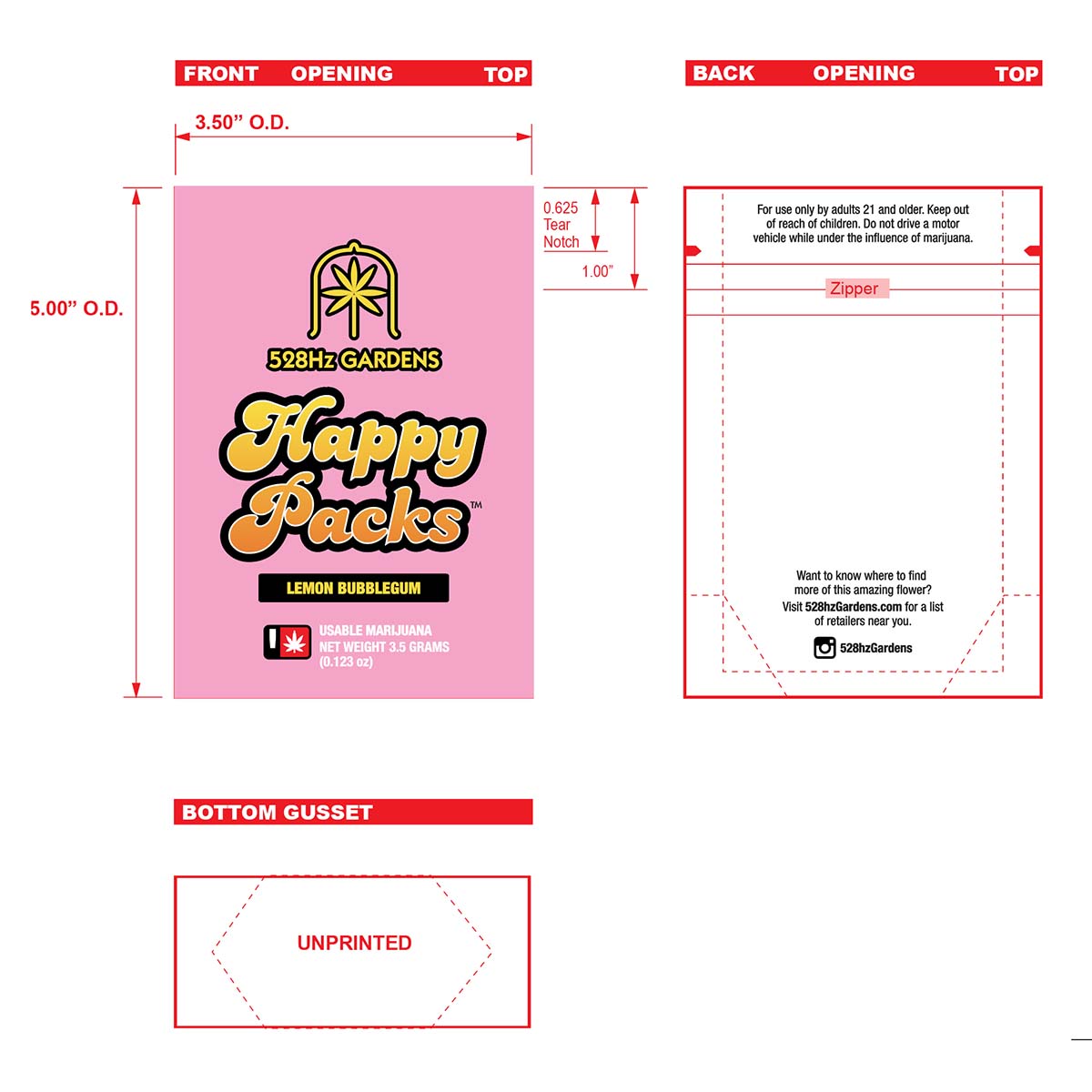
mylar bag design: happy packs
Brand reinforcement is created with this line of mylar bags for cannabis flower, which uses the same type treatment as the client's line of dabs boxes above. The color palette chosen was one of pastels and muted tones, based on analytics that showed this client's main buyers of cannabis flower were women.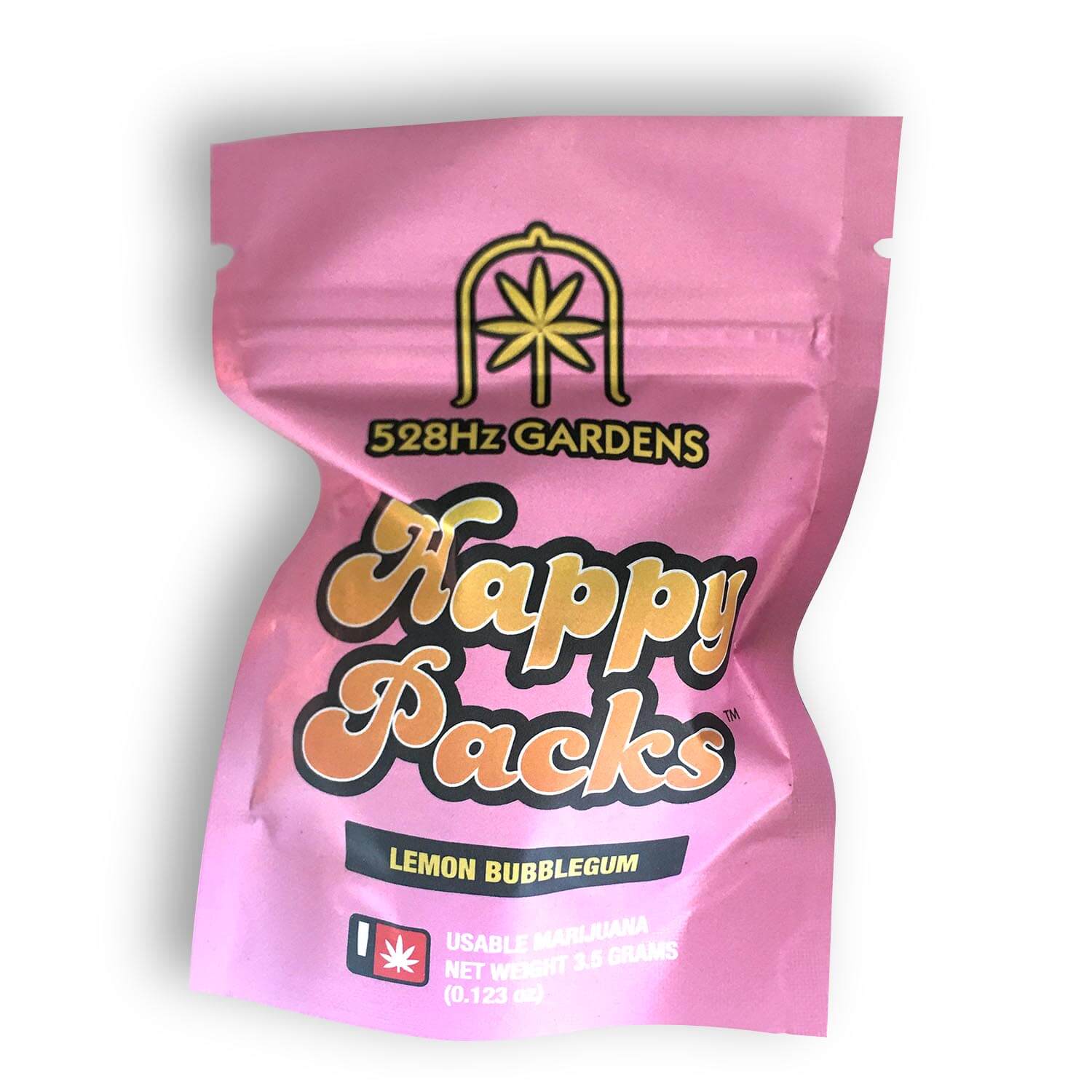
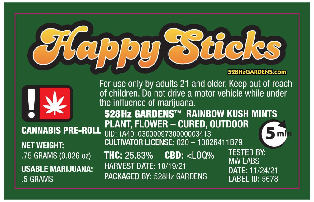
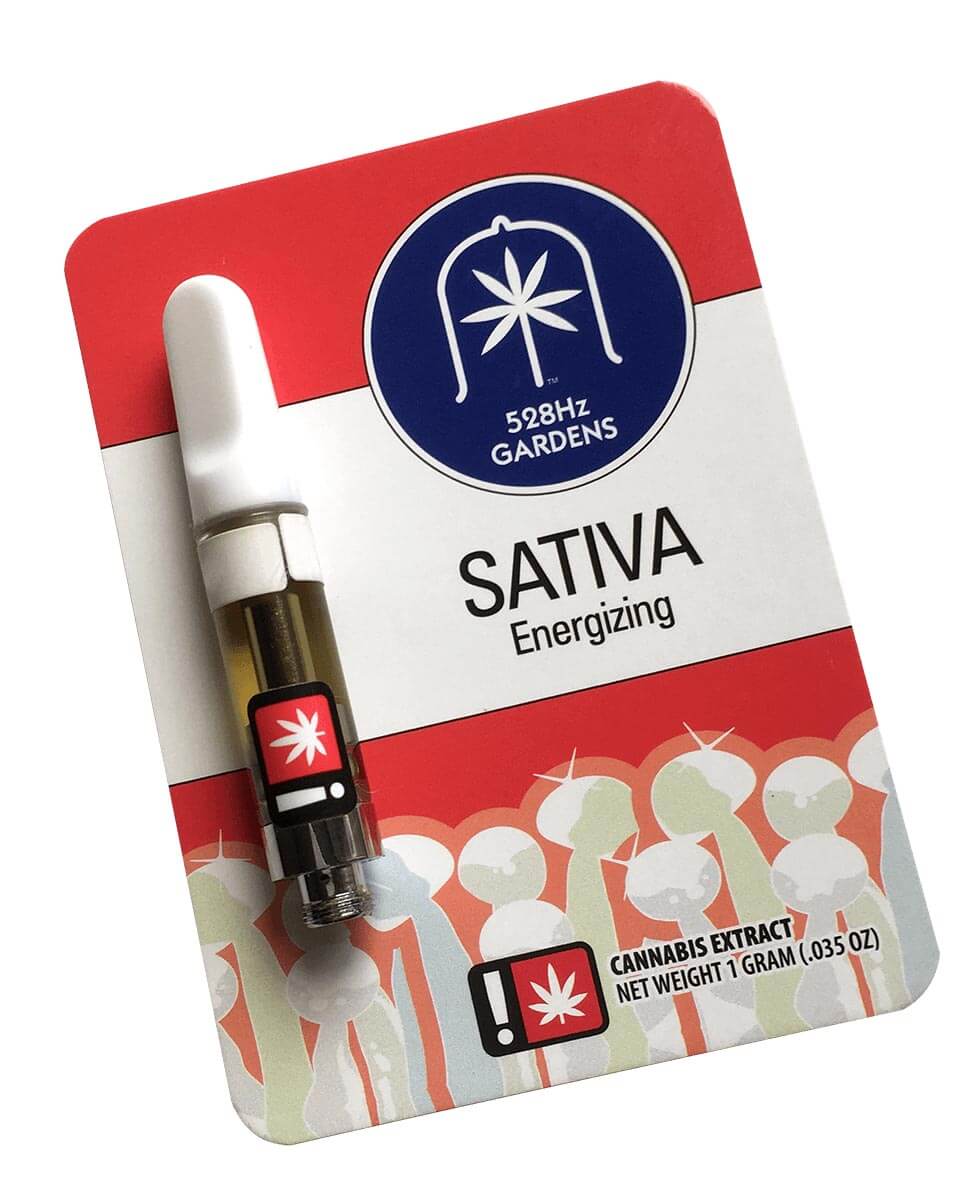
plastic pre-roll tube: cannabis cigarette
A basic and straightforward design based on the client's existing branding of previous products. This design completes this particular line of products, which can be seen together below.Clamshell PACKAGING design: cannabis vape cartridge
The client wanted a cleaner look for their line of vape pen cartridges, so the 1970s type treatment was ditched in favor of a more modern and clean typeface combined with more white space.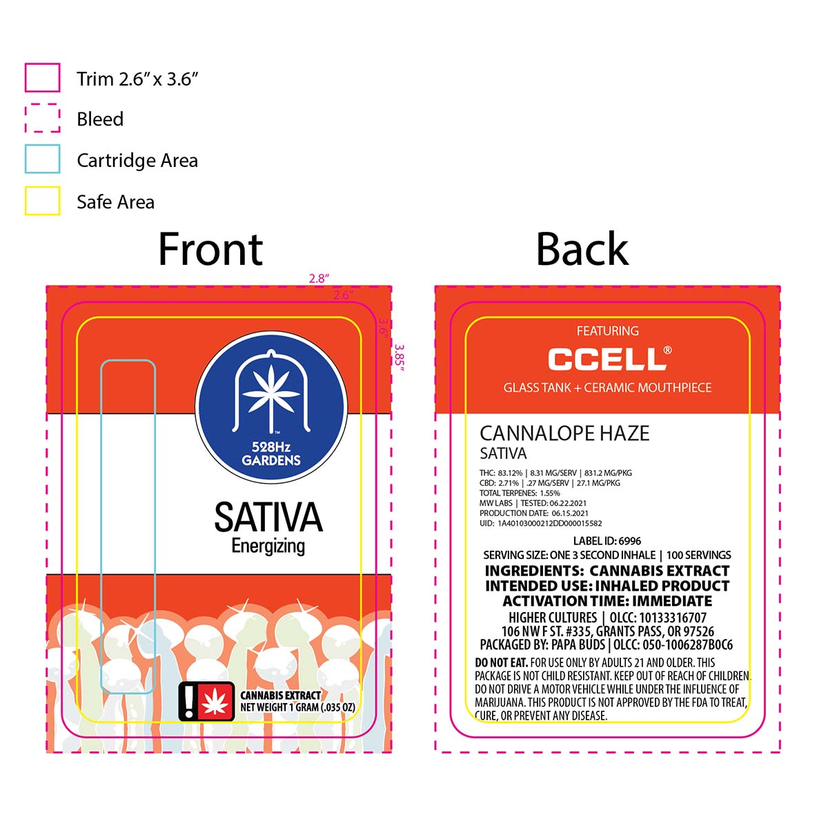
client: caldera brewing
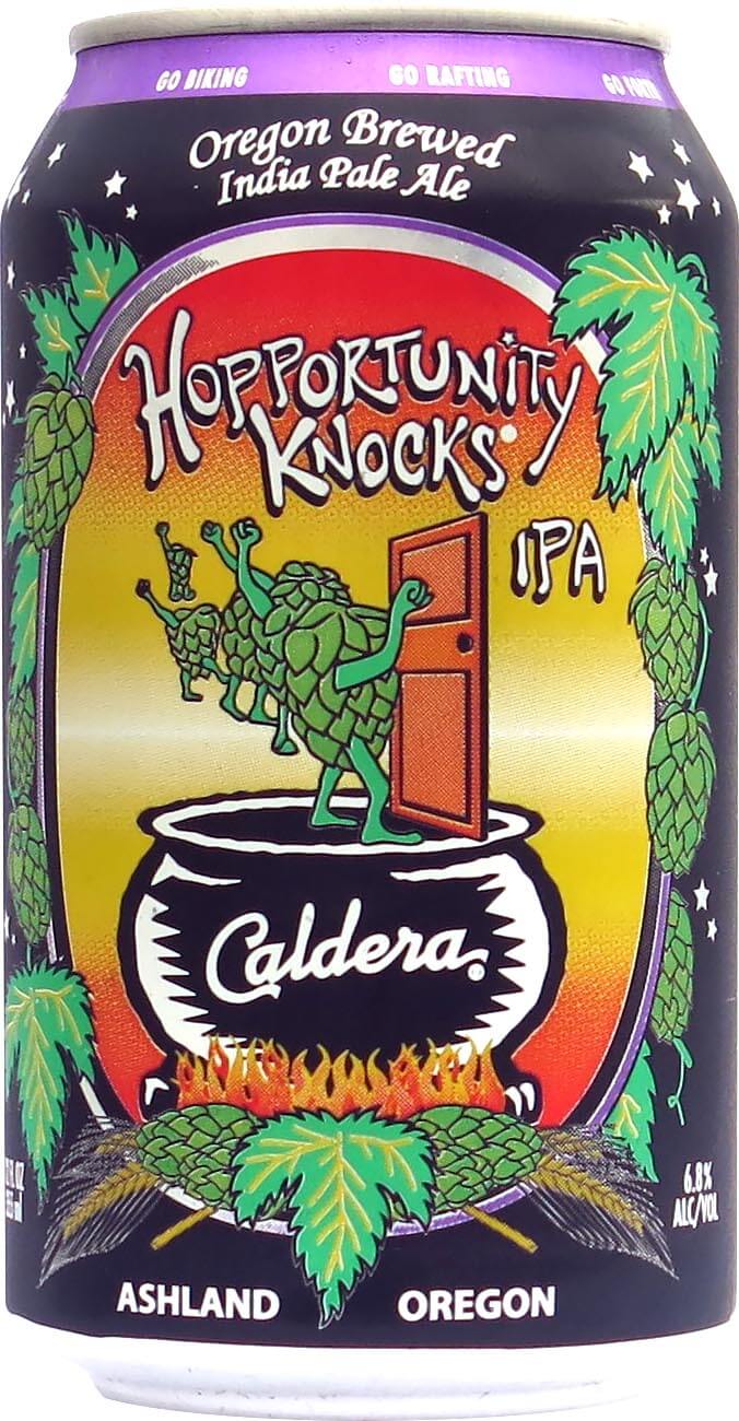
This client based in Southern Oregon has international sales in over twenty different countries and has won numerous gold medals at various beer cups.12 oz can: hopportunity knocks
Using hand-drawn lettering to go with the hand-drawn hop figures, I created this file in Adobe Illustrator using the template provided by the can manufacturer. Note the original file has the door being purple, which I like better in contrast to the yellow behind it, but the client is always right!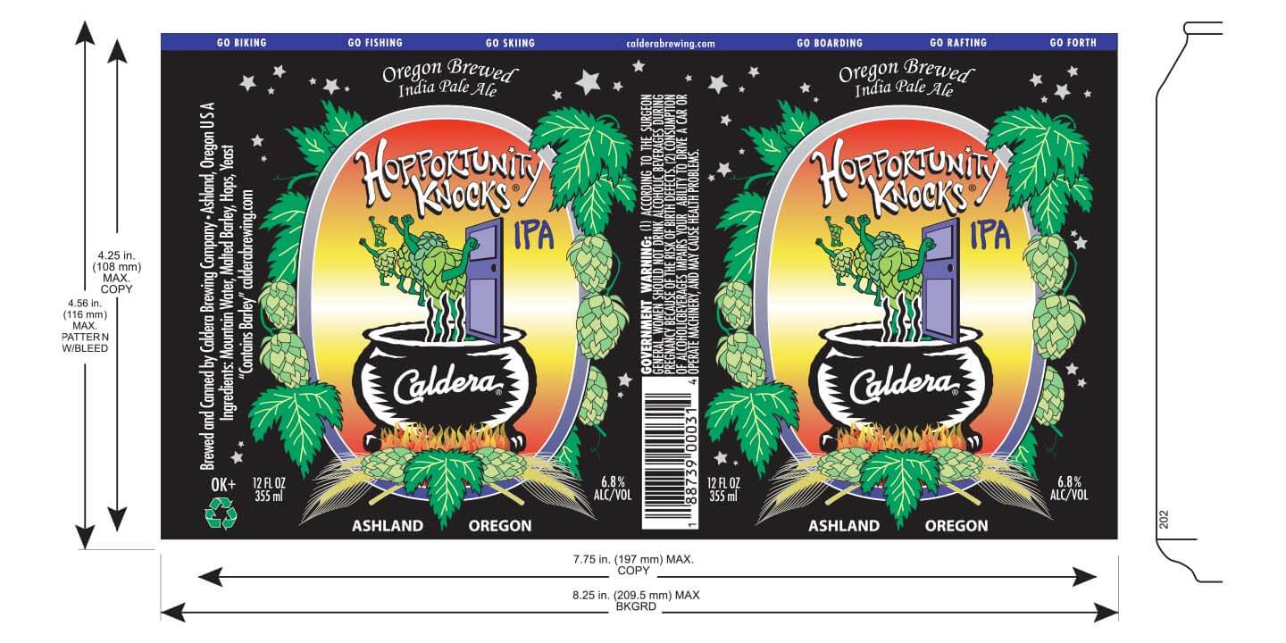
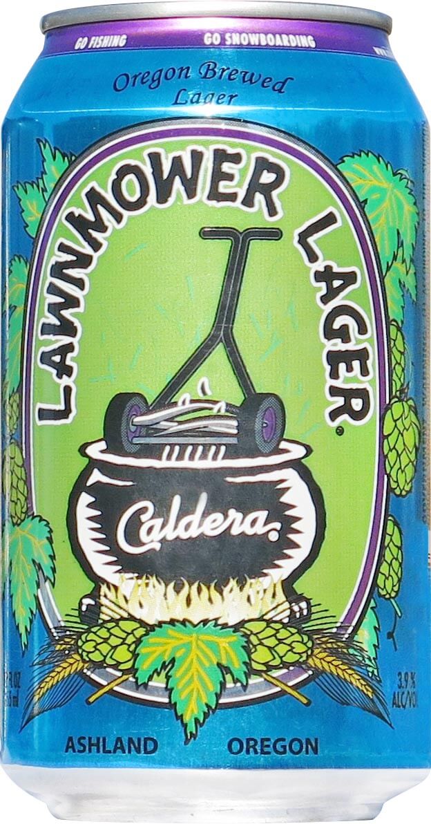
12 oz can: lawnmower lager
You'll notice the huge difference in color between the template file and the printed can. This is because the printing inks used on can printing can look radically different on screen than on the can. However, the final colors are correct, with the purple being the exact color of the client's corporate colorway.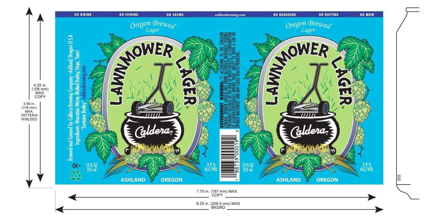
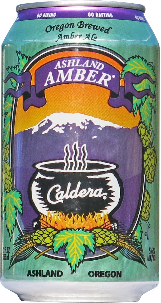
12 oz can: ashland amber
Based on the iconic ski mountain just outside of Ashland, Oregon, this has consistently been one of the client's best sellers and has received top awards.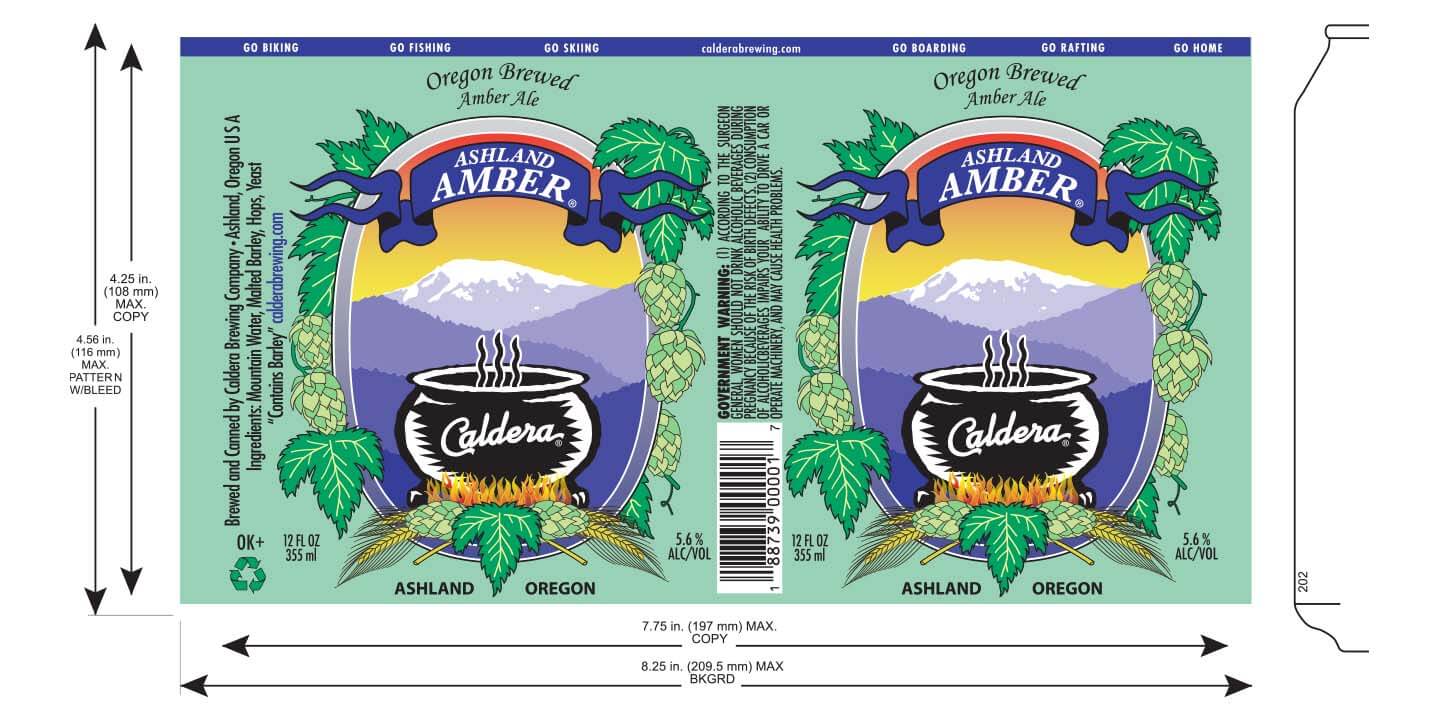
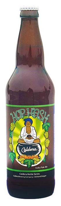
22 oz bottle: hop hash
Using hand-drawn lettering and the hand-drawn swami character with his giant ball of hashish, I loved making this label. The client got around government regulations stipulating no drug references on a beer label by going with my suggestion of making the beer description say the word hash was in reference to a breakfast hash of meat and potatoes.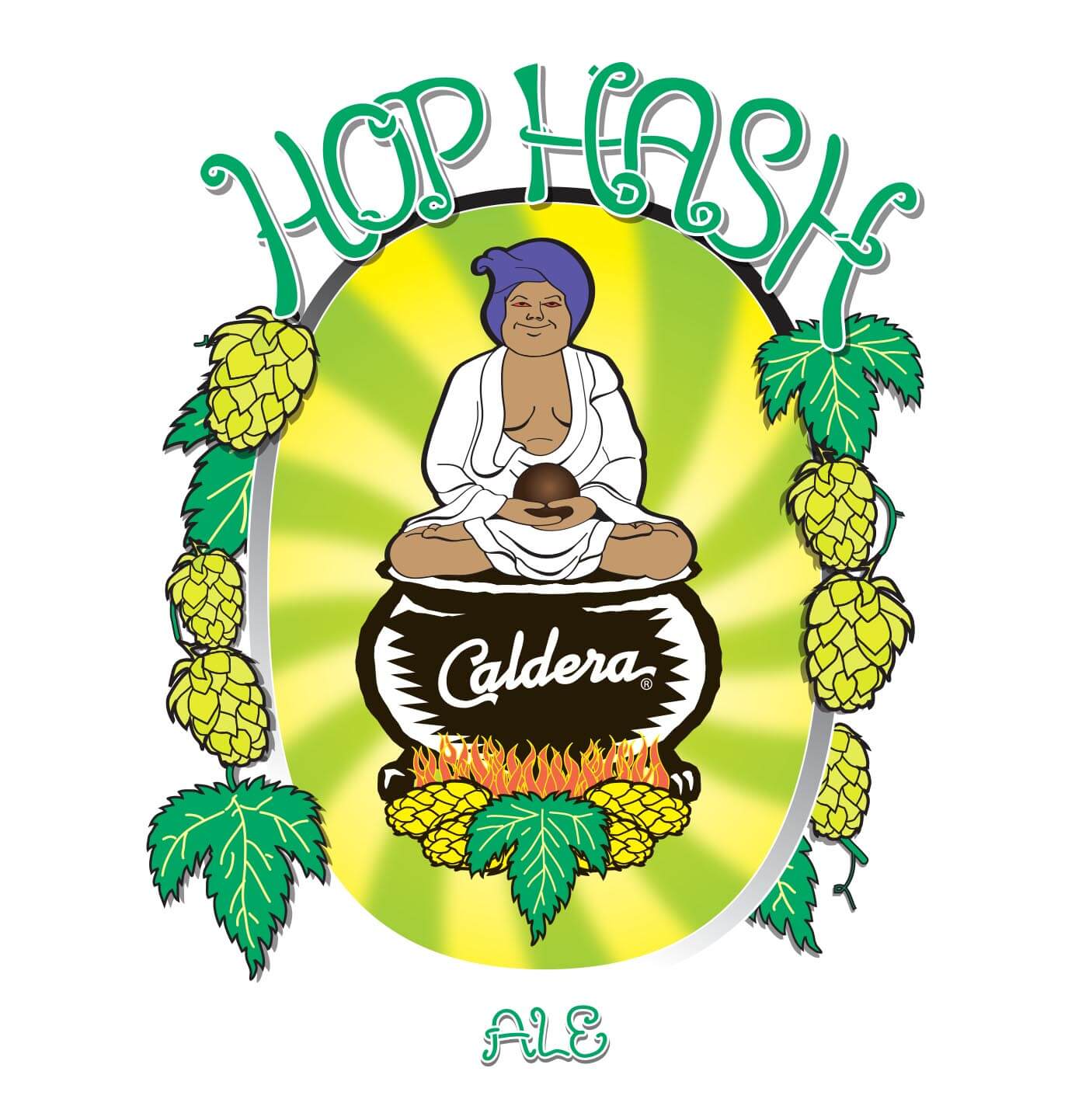
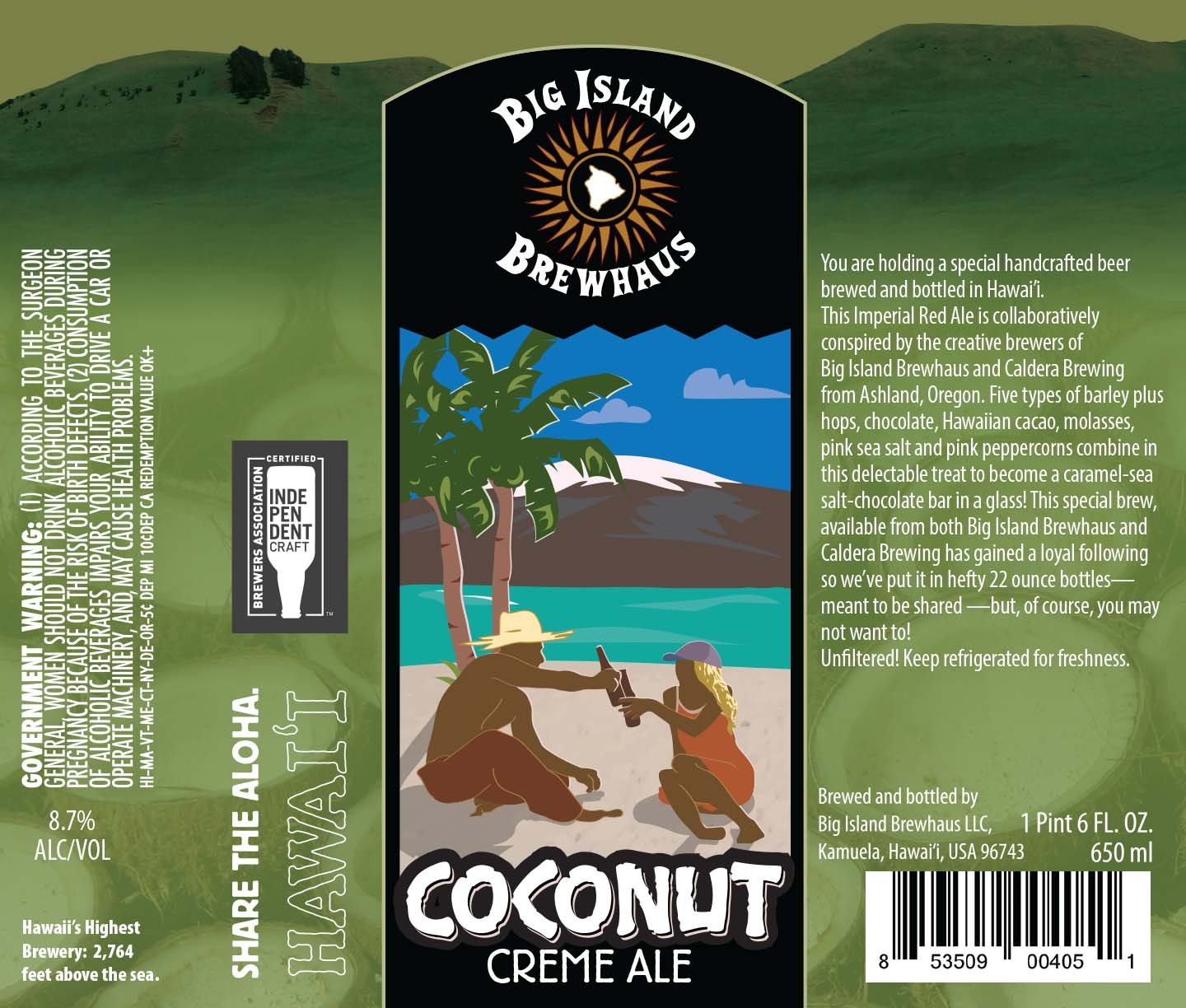
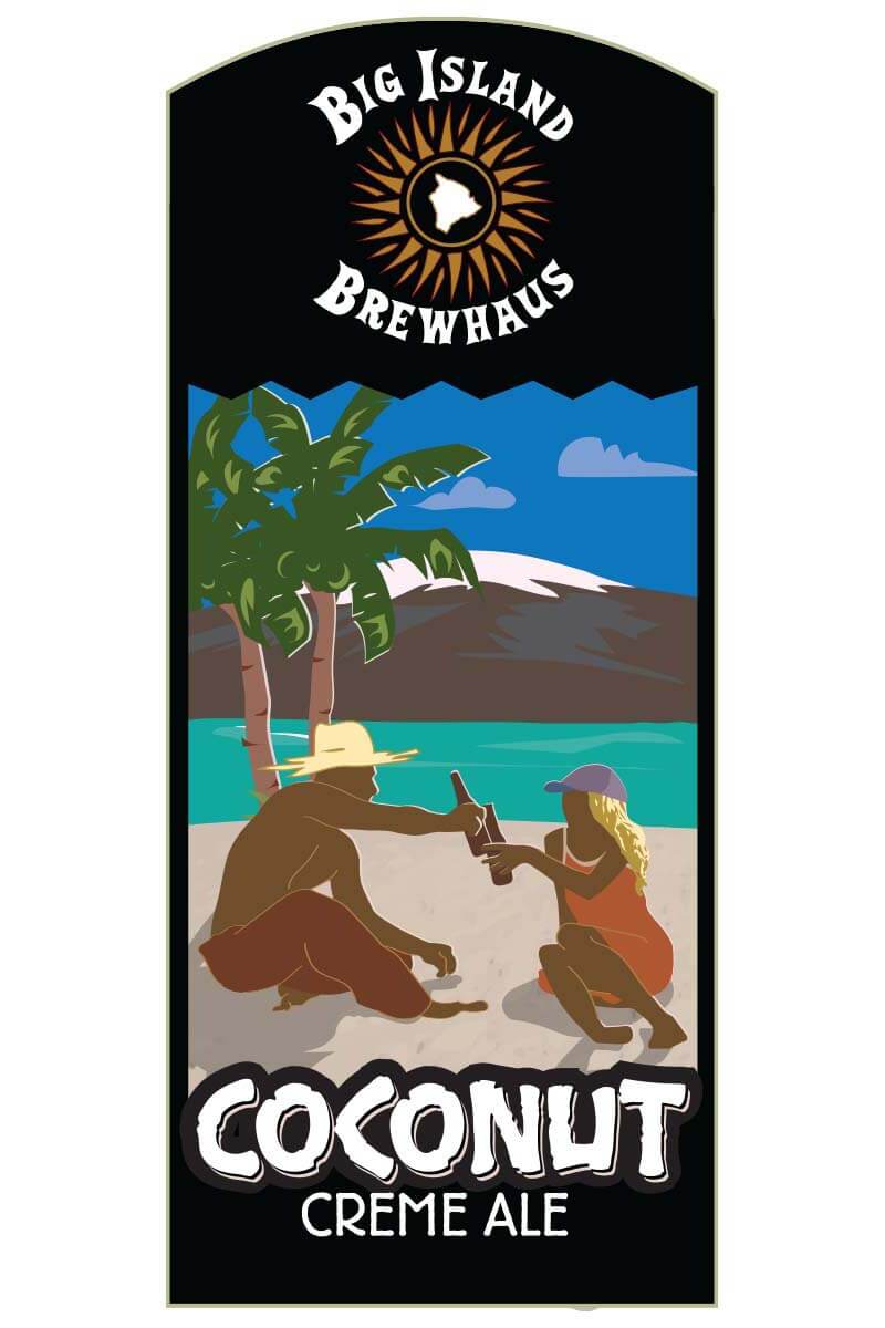
client: big island brewhaus
This client based in Southern Oregon has international sales in over twenty different countries and has won numerous gold medals at various beer cups.22 oz bottle: coconut creme ale
The silhouette figures were traced in Adobe Illustrator from two different reference photos and I love how warm and inviting this label turned out. The mountains in the background of the main label are from a photograph provided by the client, and are used in different colors for each of the four labels I was commissioned to do.